
A salon website can have beautiful photography, elegant typography, and a polished brand identity while still making visitors work too hard.
That usually happens when the website has content but lacks clear priorities.
Visitors arrive with questions.
They may want to know which treatments are available, how much something costs, whether the results look credible, where the salon is located, or how to book.
Visual hierarchy helps the website answer those questions in a sensible order.
Visual hierarchy turns business priorities into visible priorities
A useful way to think about visual hierarchy is this:
Your website is constantly telling visitors what deserves their attention.
Size can show importance.
Contrast can make an action stand out.
Spacing can separate ideas.
Grouping can show relationships.
Position can influence what visitors encounter first.
Nielsen Norman Group describes visual hierarchy as guiding the eye toward elements according to their importance and identifies scale, contrast, color, spacing, and placement as tools for creating it.
For a salon, the question is not simply whether those techniques are being used.
The question is whether they are being used for the right business priorities.
Give the homepage one clear job
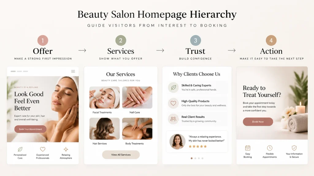
A homepage may need to introduce the salon, communicate its positioning, highlight services, establish trust, and encourage booking.
That is already a lot.
The solution is not to make every element equally prominent.
Instead, establish a hierarchy.
A practical structure might be:
First: What does the salon offer?
Next: Which services matter most to the visitor?
Then: Why should the visitor trust the salon?
Finally: What is the next useful action?
The exact sequence should change according to the salon.
A luxury bridal studio may prioritize its portfolio.
A skin clinic may need more treatment education.
A neighborhood hair salon may prioritize services, location, reviews, and booking.
The hierarchy should follow the business model.
Service cards can create the illusion of organization
A grid of identical cards looks neat.
But neatness and hierarchy are not the same thing.
Imagine ten services presented with identical:
- Images
- Headings
- Descriptions
- Buttons
- Colors
- Spacing
The visitor sees a list.
They do not necessarily understand what matters most.
If the salon wants to promote a particular treatment, that treatment can receive more visual emphasis.
This could be achieved through positioning, imagery, supporting copy, or a dedicated section.
The goal is not to make other services invisible.
It is to make the business priority visible.
Pricing needs context, not just numbers
If a salon publishes prices, visitors should be able to understand what each price represents.
A useful structure might be:
Treatment
Short description
Duration
Price
Relevant booking action
If pricing varies, explain why.
For example, a color service may depend on hair length, product requirements, or consultation.
A simple explanation can prevent the visitor from interpreting an apparently low or high price incorrectly.
The hierarchy should help the visitor understand the relationship between the information, not just display numbers.
Trust signals need the right placement
Reviews, qualifications, before-and-after examples, team information, and real photography can all contribute to trust.
But trust content is more useful when it answers an actual concern.
Someone considering an advanced skin treatment may care about professional qualifications and treatment information.
Someone choosing a stylist may care strongly about seeing previous work.
Someone comparing local salons may care about reviews and location.
Do not automatically place every possible trust element near the top.
Choose the evidence that matters to the decision.
Use photography strategically
Salon websites naturally rely on imagery.
That is an advantage.
But the most attractive photograph should not automatically become the most important element.
Ask what the image is doing.
Is it:
- Creating atmosphere?
- Demonstrating a result?
- Explaining a treatment?
- Showing the team?
- Supporting a service?
- Establishing brand personality?
Once the purpose is clear, its visual weight becomes easier to decide.
Make your primary CTA obvious, not aggressive
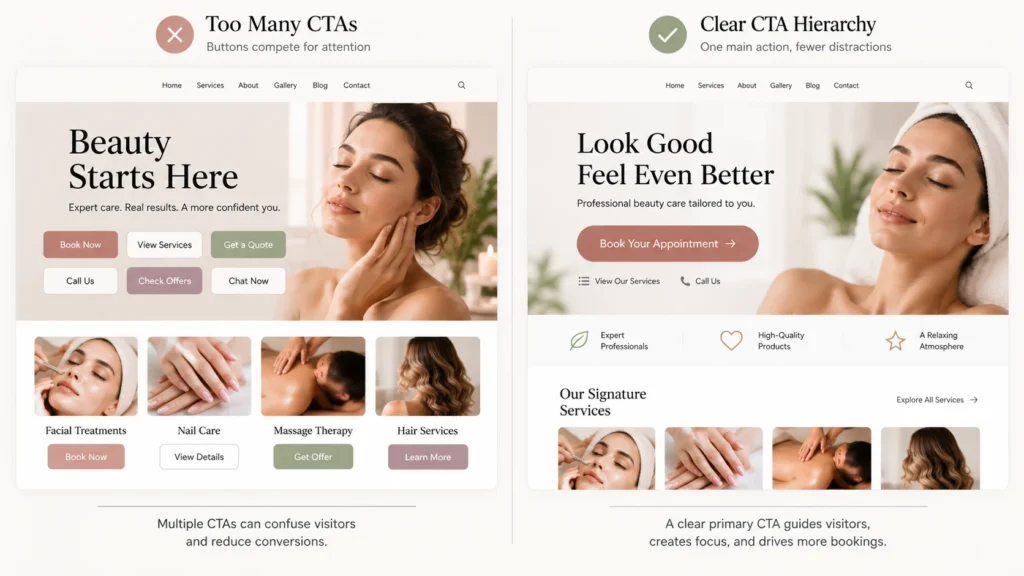
A primary booking button should be easy to find.
That does not mean it needs to dominate every section.
If every button is visually identical, there is no primary action.
If every section contains a giant “Book Now” button, the page can begin to feel pushy.
A better system is to establish a primary action and use secondary actions more quietly.
The goal is direction.
Not pressure.
White space can improve comprehension
Whitespace is often treated as an aesthetic choice.
It is also an information-organization tool.
W3C specifically recommends using whitespace and proximity to make relationships between content more apparent.
Keep related information close.
Separate unrelated sections.
Give headings enough room to establish their relationship with the content underneath.
This can make a page feel simpler without removing information.
Mobile needs its own hierarchy check
A desktop layout may show:
Service information | Image | Booking panel
On mobile, those elements may become:
Image
Service information
Booking panel
That is a completely different reading sequence.
W3C recommends considering how page information is presented across different viewport sizes and adapting layouts for smaller screens. W3C: Designing for Web Accessibility
So a mobile review should ask:
What appears first?
What appears immediately after?
Is the service understandable before the visitor sees the booking action?
Does the visitor have to scroll past decorative content to find essential information?
Those questions matter more than simply confirming that the website technically responds.
Headings should work visually and structurally
A heading is not simply large text.
It communicates structure.
W3C notes that headings organize content and can help people navigate sections of a page, including through assistive technologies.
That means a salon website should consider both the visual appearance of headings and their underlying semantic structure.
The visitor should be able to scan the page visually.
The document structure should also make sense.
A five-part review for salon owners
When reviewing the website, ask:
1. Attention
What do visitors notice first?
2. Understanding
Can they quickly explain what the salon offers?
3. Relevance
Is the most prominent information relevant to their likely question?
4. Trust
Can they find the proof they need before deciding?
5. Action
Is the next step clear?
If those five elements work together, the website can feel much easier to use without becoming visually plain.
The real objective is not more attention
This is where many redesigns go wrong.
A business notices low engagement and responds by adding:
More color.
More animation.
More banners.
More popups.
More buttons.
More badges.
More content.
But more attention is not necessarily better.
Directed attention is better.
A strong hierarchy reduces visual competition so visitors can spend their attention on the information that matters.
The right hierarchy is specific to the salon
There is no universal salon homepage formula.
Your customer base, services, pricing, positioning, location, and business model all affect the right structure.
That is why copying another salon’s website rarely solves the real problem.
Start with the visitor.
Identify the decision.
Map the information needed for that decision.
Then use design to guide attention toward it.
That is the practical value of visual hierarchy.
It turns design from decoration into communication.