

A website redesign often starts with the wrong question.
Someone looks at an older website and says, “The design feels outdated. We need something more modern.”
That may be true, but it does not tell you what actually needs to change.
A professional service website can look polished and still make potential clients work too hard to understand what the business does, whether it is right for them, what the process looks like, or how to get started. A redesign becomes much more useful when those customer problems become the starting point.
Instead of asking, “What should the new website look like?”, ask, “What are customers struggling to understand or do on the current website?”
That shift can change the entire redesign process.
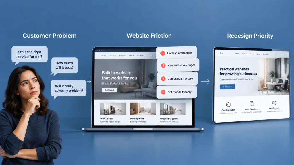
Start With the Problems Customers Are Already Experiencing
Before changing the homepage, navigation, colors, typography, or page layouts, identify the questions customers are trying to answer.
A potential client may be wondering:
- What exactly does this business do?
- Is this service relevant to my situation?
- Do they work with businesses like mine?
- Can I trust them?
- What makes their approach different?
- What happens after I contact them?
- How can I ask a question or request a consultation?
These questions are more useful than simply saying that a website needs to “look better.”
For professional service businesses, the website often has to support a decision that cannot be completed with a simple product purchase. A visitor may need to understand the service, evaluate credibility, compare alternatives, involve another decision-maker, and then decide whether contacting the business is worth the effort. Nielsen Norman Group’s research on B2B website usability similarly emphasizes supporting customers through longer buying processes, including understanding problems, evaluating solutions, and generating leads.That is why customer problems should shape the redesign before visual styling does.
Find the Questions Hidden Inside the Existing Website
One of the simplest ways to evaluate an existing website is to look at it from the perspective of someone who knows nothing about the company.
Open the homepage and ask what a first-time visitor can understand within a reasonable amount of time.
Can they tell what the company does?
Can they identify the type of customer it serves?
Can they understand the main services?
Can they see evidence that the business is credible?
Can they find a clear next step?
If the answers are unclear, the problem may not be the color scheme or the layout. It may be the information itself.
For example, imagine a consulting firm whose homepage starts with a large statement about being “committed to excellence” followed by several paragraphs about its philosophy. The website may look professional, but a visitor still may not understand what problem the firm solves or what kind of help they can actually receive.
A redesign should solve that communication problem before worrying about decorative improvements.
Turn Customer Problems Into Redesign Priorities
Once customer problems are identified, group them into practical redesign priorities.
A useful way to think about this is:
Customer problem → Website problem → Redesign response
For example:
| Customer problem | Website problem | Redesign response |
| “I do not understand what they offer.” | Vague messaging | Clarify the value proposition and service structure |
| “I cannot tell if they work with businesses like mine.” | Audience is unclear | Add relevant industries, use cases, or service context |
| “I do not know whether I can trust them.” | Weak credibility signals | Improve proof, case studies, testimonials, credentials, or experience |
| “I am not sure what happens after I contact them.” | Unclear process | Explain the next steps |
| “I cannot find the service I need.” | Poor information architecture | Rework navigation and service page structure |
| “I want to ask something before contacting them.” | Limited contact options | Improve contact paths and supporting information |
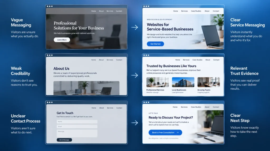
This creates a much more practical redesign brief.
Instead of telling a designer to “make the website modern,” you can say exactly what the new website needs to help customers understand and accomplish.
Your Homepage Should Answer the First Important Questions
The homepage does not need to explain everything.
It needs to help the right visitor understand where they are, what the business does, and where they can go next.
For a professional service business, the opening section should normally make the core offer understandable without forcing the visitor to decode vague marketing language.
The next sections can then provide the context needed to build confidence.
That may include:
- Core services
- Who the business helps
- Relevant problems or use cases
- Evidence of experience
- Selected case studies
- A simple explanation of the process
- Frequently asked questions
- A clear next step
The exact structure will vary by business. A law firm, accounting practice, engineering consultancy, marketing agency, and healthcare service provider will not need identical pages.
The principle is what matters: the page structure should follow the questions customers need answered.
Rebuild Service Pages Around Customer Problems
Many professional service websites treat service pages like internal company brochures.
They start with the name of the service, explain what the company offers, list features, and finish with a contact button.
That can leave an important gap.
Customers usually do not wake up thinking, “I need a company that offers Service X.”
They are more likely thinking, “I have this problem. I need someone who can help me solve it.”
A stronger service page connects the service to that problem.
For example, instead of simply describing “Website Redesign Services,” a page could explain what typically causes a redesign to become necessary, what problems the redesign addresses, what the process involves, and what the customer should expect from the new website.
This makes the page more useful while also helping the visitor determine whether the service is relevant.
Use Customer Language Instead of Internal Business Language
A redesign is also an opportunity to review the words used throughout the website.
Professional businesses often become so familiar with their own terminology that they forget how it sounds to someone outside the company.
A customer may not understand an internal service name, technical phrase, or industry abbreviation.
Clear language does not make a professional business look less sophisticated. It makes the information easier to understand.
Nielsen Norman Group has also highlighted the relationship between clear language and usability, noting that complex content can slow users down and distract from task performance. Their research on clear language and UX provides relevant context for this point.
During a redesign, review headings, service names, calls to action, navigation labels, forms, and supporting content from the customer’s perspective.
Ask whether the wording helps someone move forward or simply reflects how the business describes itself internally.
Build Trust Where Customers Need It
Trust should not be treated as a decorative section added near the bottom of a homepage.
Different customers need different forms of reassurance.
A professional service website might need to show:
- Relevant experience
- Case studies
- Client testimonials
- Professional credentials
- Certifications
- Team expertise
- Clear service processes
- Industry experience
- Useful educational content
The important question is not how many trust elements you can place on the website.
It is which concerns a potential customer is likely to have before taking the next step.
If a customer is worried about experience, show relevant experience.
If the customer is unsure about the process, explain the process.
If the customer needs to justify the decision internally, provide useful information they can understand and share.
Trust becomes more effective when it answers a real concern.
Make the Navigation Match How Customers Think
Website navigation often reflects the company’s internal structure.
Customers do not necessarily think that way.
A company may organize its services according to departments, internal teams, or technical categories. A customer may simply be looking for a solution to a specific problem.
This is where a redesign can improve more than appearance.
Review the navigation from the visitor’s perspective.
Can someone quickly identify the main service areas?
Are important pages buried under unclear labels?
Are there too many choices?
Does the structure make sense on mobile?
Can someone return to a previous section easily?
Research methods such as card sorting and tree testing are specifically used to understand how people expect information to be organized and whether they can find important content within a navigation structure.
You do not necessarily need a formal research project for every redesign, but the underlying principle is valuable: navigation should help customers find what they need, not simply reflect how the company is organized.
Look at the Contact Process as Part of the Redesign
A beautiful website can still create friction at the moment someone decides to contact the business.
The contact page is not just a place to put an email address.
Think about what happens immediately before someone reaches it.
What information have they already seen?
What question are they likely trying to ask?
Do they need to provide a lot of information?
Is the form appropriate for the type of inquiry?
Do they know what happens after submitting it?
A professional service business may benefit from different contact paths depending on the situation. Someone ready for a consultation may want a form, while someone with a quick question may prefer another communication option.
The redesign should make the next step feel clear rather than making the visitor figure it out.
Do Not Redesign Every Page at the Same Time
A customer-problem-led redesign does not mean every page needs to be completely rebuilt.
Some existing pages may already work well.
Others may contain useful content but need better structure.
Some may need rewriting.
Some may no longer deserve to exist.
Start by identifying the pages that have the greatest impact on the customer journey.
For many professional service websites, that may include:
- Homepage
- Core service pages
- About or credibility page
- Case studies or portfolio
- Contact or consultation page
The exact priority depends on the business.
The point is to redesign based on importance rather than treating every page as equally urgent.
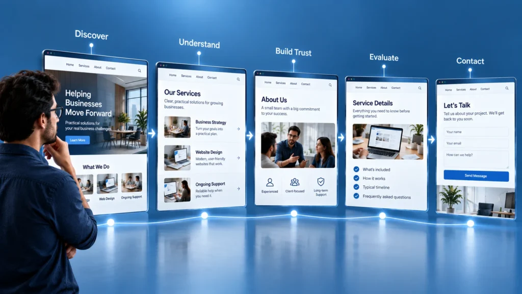
Think About the Customer Journey, Not Just Individual Pages
A visitor does not experience your website as a collection of disconnected pages.
They move through it.
Someone may discover the business through search, arrive on a service page, visit the About page, review a case study, return to the service page, and then contact the business.
Another visitor may arrive directly on a case study and then look for the relevant service.
This is why redesign decisions should consider the journey between pages.
A user journey looks at the broader experience around a customer goal, while a user flow focuses more closely on the specific interactions needed to complete a task.
For a redesign, this distinction can be useful.
Ask what the customer is trying to accomplish and what sequence of information helps them get there.
Then make the pages support that journey.
Use Analytics and Real Customer Feedback When Available
Your existing website may already contain clues about customer problems.
Look at the information available to you.
Which pages receive attention?
Where do people seem to leave?
Which services receive inquiries?
What questions repeatedly appear in emails or sales calls?
What do customers ask before becoming clients?
What information do people misunderstand?
You do not need to turn the redesign into a massive data project.
Even a small collection of real customer questions can reveal patterns that internal discussions miss.
If several people repeatedly ask the same question before contacting the business, that question probably deserves a place on the website.
Do Not Let Design Trends Decide the Redesign
A redesign can become distracted by visual trends.
A new animation looks impressive.
A new layout style looks modern.
A large interactive section appears on another website.
But the important question remains: does this help the customer?
A professional website does not need to follow every design trend.
It needs to communicate clearly, create confidence, support the customer journey, work across devices, and make the next step understandable.
A visually modern website that creates confusion is still a poor redesign.
Test the New Website Against the Original Problems
Before launching, return to the problems that started the redesign.
If the old website was unclear about services, can visitors now understand them?
If trust was weak, does the new site provide relevant evidence?
If navigation was confusing, can people find important information more easily?
If the contact process created friction, is the next step clearer?
If the old site spoke mostly about the company, does the new version communicate more clearly around customer needs?
This is where a redesign becomes measurable in a practical sense.
You are no longer asking whether the new website looks better.
You are asking whether it solves the problems that justified the redesign in the first place.
What a Customer-Problem-Led Redesign Really Changes
The biggest change is not necessarily visual.
It changes how decisions are made.
Instead of beginning with colors, layouts, animations, or inspiration from other websites, you begin with customer questions, uncertainty, friction, and business goals. The visual design then becomes a way to communicate those decisions more clearly.
That approach also helps prevent unnecessary redesign work. You may discover that one confusing service page needs more attention than ten minor visual issues across the site.
If you are reviewing an existing website, start by writing down the five questions customers most often ask before contacting the business. Then compare those questions with the current website. The gaps between the two can give you a much stronger redesign starting point than a collection of design trends ever will.