

A referral form can look like a very small part of a website. In practice, it can influence how easily someone recommends your business, how much useful information you receive, and what happens after the referral is submitted.
The mistake is usually not that the form is badly designed. It is that the form asks for information the person making the referral does not actually need to provide.
If you run a service-based business, the goal should be simple: make it easy for someone to introduce a potential customer while collecting enough information for your team to understand what happens next.
That means the right referral form is not necessarily the longest or most detailed one. It is the one that removes unnecessary friction without leaving your team guessing.
Start With the Referral Journey, Not the Form Fields
Before deciding what fields to add, think about what actually happens when someone recommends your business.
Imagine a past client wants to refer a colleague to your consulting business. They know the colleague’s name, email address, and perhaps the reason they might need your service. They probably do not know every detail your sales team would normally ask during an enquiry.
That distinction matters.
A referral form is not the same as a standard contact form. A contact form is usually completed by the person interested in buying. A referral form is often completed by someone who is introducing that person.
The person making the referral should not have to complete half of your sales process.
A useful referral journey might look like this:
Existing customer or partner → Referral form → Internal review → Contact with referred person → Follow-up
Once you see the journey this way, the form becomes much easier to design.

Decide What You Actually Need to Know
A simple referral form normally needs information from two sides: the person making the referral and the person being referred.
For example:
| Information | Why it may be useful |
| Referrer’s name | Helps identify who made the introduction |
| Referrer’s email | Allows follow-up if clarification is needed |
| Referred person’s name | Identifies the potential customer |
| Referred person’s email or phone | Provides a way to make contact |
| Reason for referral | Gives useful context before outreach |
| Relationship | Helps your team understand the introduction |
| Permission or consent information | Helps clarify how the introduction should be handled |
You do not necessarily need every field in every situation.
If the referral is informal and your team already knows the referrer, asking for their full company details, address, job title, and other information may only make the process slower.
A good question to ask for every field is:
Will we actually use this information after the referral is submitted?
If the answer is no, remove it.
Keep the First Screen Simple
A referral form should feel easier than contacting the business directly.
That does not mean hiding important information. It means presenting the information in an order that makes sense.
A practical structure could be:
1. Who are you?
- Your name
- Your email
2. Who are you referring?
- Their name
- Their email or phone
3. Tell us a little about the introduction
- How do you know them?
- What do you think they need help with?
4. Submit
The form can then end with a clear message explaining what happens next.
This structure is easier to understand than placing ten unrelated fields on the page.
If the form genuinely requires more information, group related fields together rather than presenting one long uninterrupted column.
Ask One Useful Open-Ended Question
One of the most valuable fields in a referral form can be a simple question such as:
“What would you like us to know about this referral?”
That gives the person making the introduction room to explain the situation in their own words.
For example:
“Sarah runs a growing accounting firm and is looking to improve the website before launching a new service.”
That small piece of context can be more useful than several rigid dropdowns.
You could also make the question more specific:
“What do you think they need help with?”
Use the version that matches how your team actually handles referrals.
The goal is not to collect a detailed sales brief. The goal is to give the next person enough context to start the conversation intelligently.
Do Not Make Every Field Required
One of the easiest ways to make a referral form frustrating is to make everything mandatory.
The person referring someone may not know their phone number. They may not know the person’s company size. They may not know exactly which service they need.
If you require information they cannot reasonably provide, they may abandon the form or enter inaccurate information.
W3C’s guidance on form instructions and labels emphasizes helping people understand what information is required, what format is expected, and how individual controls should be completed.
A practical approach is to make only genuinely necessary information required.
For example:
Required
- Referrer’s name
- Referrer’s email
- Referred person’s name
- At least one contact method
Optional
- Company
- Relationship
- Additional context
- Notes
The exact combination depends on your referral process.
Make the Form Easy to Understand Without Reading Everything
People should not have to study the page to understand what the form is asking them to do.
Use straightforward labels such as:
- Your name
- Your email address
- Person you’re referring
- Their email address
- Their phone number
- How do you know them?
- What do you think they need help with?
Avoid labels that require interpretation.
For example, instead of:
Lead Information
say:
Who are you referring?
Instead of:
Additional Details
say:
What would you like us to know about this referral?
Clear language reduces hesitation.
W3C also recommends using descriptive labels for form controls so people can understand the purpose of each field.
Be Careful With the Referred Person’s Information
This is one area where a referral form deserves more thought than a normal contact form.
The person filling out the form is providing someone else’s information. You should therefore avoid treating the referral as if the referred person personally submitted the enquiry.
The form can explain what will happen after submission.
For example:
“We’ll review the referral and may contact the person you introduced using the information provided.”
The exact wording should match how your business handles referrals and any applicable privacy requirements.
If your process requires explicit permission or a particular consent mechanism, build that into the form rather than assuming the person making the referral has automatically provided it.
Use Helpful Dropdowns Carefully
Dropdowns can make information easier to organize, but they can also make a simple form feel unnecessarily complicated.
A question such as:
How do you know this person?
might work well with a small set of options:
- Existing client
- Former client
- Business partner
- Colleague
- Friend or family
- Other
But do not create a dropdown with twenty relationship types just because you can.
The same principle applies to service selection.
If your business has three or four clear service categories, a simple selection may be useful. If you offer dozens of services, forcing the referrer to identify the exact service may create unnecessary friction.
Sometimes the open-ended question is enough.
Think About the Message After Submission
The form does not end when someone clicks Submit.
The confirmation message is part of the referral experience.
Instead of a generic:
“Your form has been submitted.”
consider something that answers the obvious next question:
“What happens now?”
For example:
“Thanks for making the introduction. We’ll review the information and follow up with the person you referred. If we need anything else from you, we’ll get in touch.”
The exact message should reflect your real process. Do not promise a response time unless your business can consistently meet it.
W3C’s form guidance recommends providing clear feedback after submission and making errors understandable and actionable.
That applies to both successful submissions and failed ones.
Make Errors Easy to Fix
A referral form should not make someone restart the entire process because one field is incorrect.
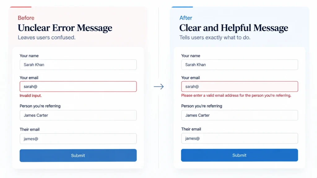
If the email address is invalid, tell them exactly what needs to be corrected.
Instead of:
“Invalid input.”
use:
“Please enter a valid email address for the person you’re referring.”
The difference is small, but it makes the form feel much more considerate.
W3C’s validation guidance recommends validating input while providing accessible feedback that helps users correct mistakes.
Design for Mobile From the Beginning
A referral form may be completed from a phone after someone receives a message, email, or link.
That means the mobile experience should not be treated as an afterthought.
Keep fields comfortably sized, use clear labels, avoid unnecessary horizontal layouts, and make the submit button easy to reach.
A two-column desktop form might look clean, but if it becomes cramped on mobile, stack the fields.
The goal is not to make the form visually impressive.
The goal is to make completing it feel obvious.
Think About What Happens Inside Your Business
The front end is only half of the referral system.
Once someone submits a referral, your internal process needs to make sense too.
At minimum, decide:
- Who receives the referral?
- Where is the submission stored?
- Who reviews it?
- How quickly should it be reviewed?
- Who contacts the referred person?
- What happens if the information is incomplete?
- How do you record the referral source?
- How do you know whether the referral eventually became an opportunity or customer?
A beautifully designed form can still create a poor experience if submissions disappear into an inbox with no clear ownership.
The form should fit the business process behind it.
Consider Tracking the Referral Source
If referrals are an important source of enquiries, you may eventually want to understand which channels are generating them.
You could record a simple field such as:
How did you hear about our referral program?
But there is another distinction worth making. The person submitting a referral is not necessarily the same thing as the marketing source that brought them to the form.
If you promote the referral page through email, social media, partner links, or other campaigns, campaign tracking can provide additional context. Google’s Analytics documentation explains how campaign parameters such as UTM values can be used to identify traffic from particular campaigns.
Do not add tracking complexity simply because it exists. Use it when the information will help you understand or improve the referral process.
A Simple Referral Form Structure You Can Start With
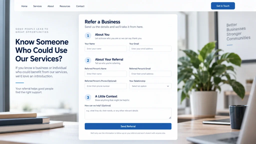
For many service businesses, the following structure is enough to create a useful first version:
Referral Form
Know someone who could benefit from our services? Tell us a little about them and we’ll take it from there.
About You
- Name *
- Email *
About Your Referral
- Name *
- Email or phone *
- Company
- How do you know them?
A Little Context
- What do you think they need help with?
Permission / Referral Notice
- Short explanation of how the submitted information will be used
Submit Referral
Confirmation
- Thank the referrer
- Explain what happens next
- Set expectations without making unsupported promises
That is enough to create a useful starting point without turning the referral process into a full qualification form.
Where Referral Forms Commonly Go Wrong
The problems are usually predictable.
Too many fields.
The business wants more information, so the form keeps growing. The referrer sees work instead of a quick introduction.
Unclear labels.
Internal terminology makes sense to the business but not necessarily to the person completing the form.
Everything is required.
The form assumes the referrer knows information they may not have.
No explanation of what happens next.
The person submits the referral and has no idea whether the business will contact them, contact the referral, or do something else.
Poor mobile layout.
The form technically works, but entering information on a phone is uncomfortable.
No internal follow-up process.
The submission arrives, but nobody clearly owns the next step.
Too much emphasis on design.
The form looks polished but asks the wrong questions.
The last problem is particularly important.
A referral form is a business process presented through a website interface. Good design starts with the process.
A Practical Way to Review Your Referral Form
Before publishing the form, complete it yourself as if you were referring someone you know.
Then ask:
- Do I understand what this form is for immediately?
- Do I know what information I need before starting?
- Can I complete it without knowing unnecessary details?
- Are the required fields genuinely necessary?
- Are the labels obvious?
- Can I complete it comfortably on mobile?
- Does the confirmation message explain what happens next?
- Does my team know what happens after submission?
- Can we identify who made the referral?
- Can we follow up without searching through unrelated systems?
If you hesitate at any point, the form probably needs another pass.
What a Simple Referral Form Should Really Do
A referral form does not need to collect everything about a potential customer.
It needs to make one specific action easy: introducing the right person to your business with enough context for the next conversation to begin well.
That changes how you approach the design. Instead of asking, “What information could we collect?”, ask, “What information do we genuinely need to move this referral forward?”
That usually leads to a shorter form, clearer questions, better submissions, and a smoother experience for everyone involved.
If your current referral form feels more like a sales application than a simple introduction, review the journey before redesigning the interface. The biggest improvement may not come from changing colors, fields, or buttons. It may come from deciding what the form actually needs to accomplish