You can have a great product, competitive pricing, and a well-designed store, yet still lose customers on the product page.
The problem is often not the product itself. It is the moment when someone is deciding whether they understand the product, trust the business, and feel comfortable taking the next step.
A strong WooCommerce product page does more than display a product name, image, price, and Add to Cart button. It answers the questions a customer is likely to have before buying and removes unnecessary uncertainty along the way.
That is why product page design should be treated as part of your ecommerce strategy, not simply as a page-building exercise.
Start With the Customer’s Decision
When someone lands on a product page, they are usually trying to answer a few practical questions:
- What exactly is this?
- Is it right for me?
- What does it look like in real life?
- How much does it cost?
- What options are available?
- When will I receive it?
- Can I trust this store?
- What happens if I have a problem?
- What should I do next?
A good product page makes those answers easy to find.
WooCommerce itself provides product fields for descriptions, pricing, inventory, shipping, attributes, variations, reviews, and other product information. The platform gives you the building blocks, but the way you organize and present them determines how useful the page feels to a customer.
The important distinction is this: your product page should support a buying decision, not simply contain product information.
The First Screen Has a Very Specific Job
The top portion of the page should quickly establish what the customer is looking at and what they can do next.
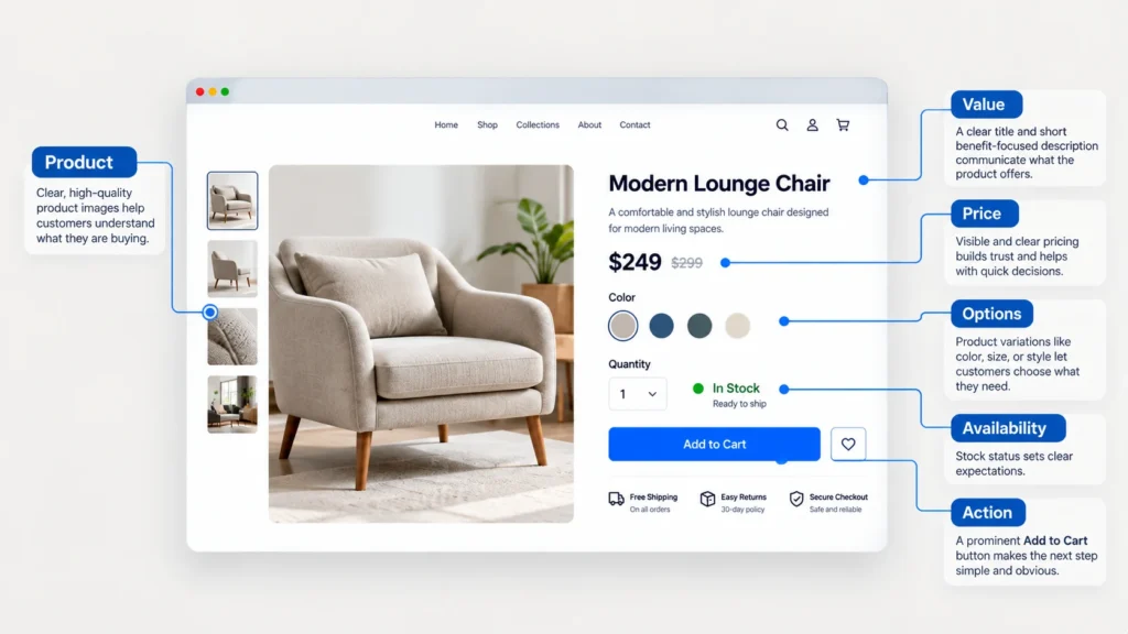
A typical product page should make the following elements easy to understand without forcing the visitor to search around:
- Product name
- Strong primary product image
- Price
- Short value-focused description
- Product options or variations, when applicable
- Availability information
- Primary Add to Cart action
- Important reassurance such as shipping, returns, or delivery information
The goal is not to place everything above the fold. The goal is to make the buying decision understandable from the beginning.
For example, imagine you sell premium running shoes. A customer should not have to scroll through a long brand story before discovering whether the shoes are available in their size. The product page should immediately communicate what the product is, why it may be relevant, how much it costs, and how the customer can choose the correct option.
Product Images Should Answer Questions
Product photography is not decoration. It is part of the product explanation.
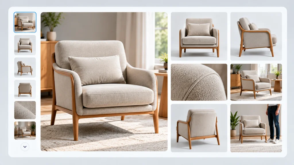
WooCommerce supports a main product image and product galleries, while its current product gallery tools can also support image and video browsing, zoom, full-screen viewing, and navigation.
Use the gallery to answer questions that customers cannot resolve from the product name alone.
Depending on the product, that may mean showing:
- Multiple angles
- Close-up details
- Product dimensions or scale
- Packaging
- Different colors
- Product-in-use images
- Important materials or textures
- Before-and-after context where appropriate
The main image should establish the product clearly. The supporting images should reduce uncertainty.
If your product requires visual inspection before purchase, a single generic image is rarely enough.
Write Product Copy Around Customer Questions
A product description should not simply repeat specifications.
Think about what the customer needs to understand before deciding.
A useful product page can have a short summary near the purchase area followed by a more detailed explanation lower on the page. WooCommerce supports both a detailed product description and a short product description, giving you a practical way to separate immediate decision-making information from deeper product details.
Instead of writing:
Premium stainless steel water bottle with double-wall insulation.
You could explain what that means for the buyer:
A reusable stainless steel bottle designed to keep drinks insulated while remaining easy to carry during work, travel, or everyday use.
The second version gives the customer context. It connects the feature to a practical use.
That is the difference between listing a feature and explaining its value.
Make Variations Easy to Understand
If your product comes in different sizes, colors, materials, or configurations, the customer should not have to guess which combination they are selecting.
WooCommerce variable products can use attributes to create different variations, with individual variations capable of having their own product data such as SKU, image, price, and stock level.
Good variation design means:
- Use familiar labels.
- Make the selected option obvious.
- Avoid unnecessary choices.
- Show relevant imagery when the variation changes the appearance.
- Make unavailable combinations clear.
- Avoid forcing customers to remember what they selected.
If choosing a size or configuration is complicated, the page should help the customer make that decision rather than simply presenting every possible option.
Trust Should Appear Before the Customer Needs It
A customer may like the product and still hesitate because the business feels uncertain.
This is where trust elements become important.
Depending on the business, useful information may include:
- Customer reviews
- Clear return information
- Shipping expectations
- Secure checkout messaging
- Warranty information
- Product guarantees
- Business contact information
- Frequently asked questions
- Relevant certifications or product information
Reviews can be especially useful because they help answer questions that the business itself cannot answer as convincingly.
But trust is not about filling the page with badges.
Too many trust symbols can make a product page feel defensive. Show the information that actually reduces the customer’s concern.
Reviews Should Help Customers Decide
A review section is more useful when it contains meaningful customer experiences rather than a collection of vague five-star comments.
For example, reviews can help answer:
- Was the product easy to use?
- Did the size match expectations?
- How was the quality?
- Was delivery straightforward?
- Who is the product particularly suitable for?
If your products receive genuine reviews, make them easy to read and place them where they support the buying journey.
WooCommerce’s product details can include reviews alongside description and additional product information, depending on how the store is configured.
The Add to Cart Area Needs Clarity
The Add to Cart button is important, but making it larger is not a complete conversion strategy.
Before someone clicks it, they should understand what they are purchasing and what options they have selected.
The purchase area should make the following clear:
Product → Choice → Price → Availability → Action
If the customer has to scroll back and forth to check their size, color, price, or stock status, the interface is creating unnecessary friction.
For longer product pages, a sticky Add to Cart feature can also be useful in some store designs. WooCommerce supports a sticky Add to Cart option that keeps the product information and purchase action visible after the original purchase area has moved out of view.
That does not mean every store needs a sticky button. It should be tested against the page layout and shopping behavior.
Shipping and Returns Should Not Be Hidden
One of the easiest ways to create hesitation is to leave important purchasing conditions unclear.
Customers may want to know:
- How much shipping costs
- Where you ship
- How long delivery usually takes
- Whether free shipping applies
- Whether returns are accepted
- How returns work
- Whether certain products are excluded
You do not necessarily need a huge block of policy text beside the Add to Cart button. Short, visible summaries can provide the right amount of reassurance, with links to the full policies for customers who want more detail.
The principle is simple: do not make customers discover important purchasing conditions after they have already decided to buy.
Use Product Recommendations Carefully
Related products, complementary products, and frequently purchased items can help customers discover useful additions.
But recommendations should have a reason for being there.
If someone is viewing a camera, recommending a compatible memory card may make sense. Showing twelve unrelated products simply because the system can display them adds noise.
WooCommerce’s Product Recommendations extension supports rule-based recommendation engines and different placements across product, shop, cart, checkout, and other pages.
The strategic question is not, “What else can I show?”
It is, “What additional product would genuinely help this customer?”
Think About Mobile Before You Publish
A product page that looks excellent on a desktop monitor can become difficult to use on a phone.
On mobile, pay particular attention to:
- Image size and cropping
- Variation selectors
- Button size
- Sticky elements
- Product description length
- Spacing between actions
- Review readability
- Shipping and returns information
- Page loading performance
A customer should be able to understand the product and purchase it without fighting the interface.
Do not treat mobile optimization as a final technical adjustment. For many stores, it is part of the core shopping experience.
SEO Matters, But Product Page SEO Starts With Useful Information
A product page should be understandable to both customers and search engines.
That means using a clear product name, descriptive content, meaningful product attributes, useful images, and accurate product information.
Structured data can also help search engines understand product information. Google explains that Product structured data can make a page eligible for product snippets containing information such as price, availability, ratings, and review information when the relevant requirements are met.
But structured data does not compensate for a weak product page.
Start with the customer experience. Then make sure the technical SEO accurately represents what is already on the page.
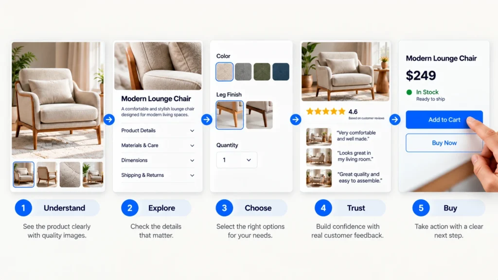
A Good Product Page Is a Connected System
The strongest WooCommerce product pages are not built by adding isolated elements one after another.
The image supports the product explanation.
The product explanation supports the value proposition.
The variations help the customer configure the right product.
The reviews reduce uncertainty.
The shipping and returns information reduces risk.
The Add to Cart area makes the next action obvious.
The related products help the customer continue shopping when there is a genuine reason to do so.
That connection is what makes the page feel easy.
What to Review Before Publishing a Product Page
Before launching or redesigning a product page, walk through it as if you were a first-time customer.
Ask yourself:
- Can I understand what this product is within a few seconds?
- Can I see the product clearly from useful angles?
- Do I understand why it may be useful to me?
- Can I easily choose the right variation?
- Can I see the price and availability clearly?
- Do I know what happens after I purchase?
- Can I find shipping and return information without hunting for it?
- Is there enough evidence to trust the purchase?
- Is the Add to Cart action obvious?
- Can I complete the same journey comfortably on mobile?
If several answers are no, adding more design elements probably is not the first thing you need.
The better starting point is identifying where the buying journey becomes unclear.
The Practical Standard for a WooCommerce Product Page
A good WooCommerce product page does not need to be visually complicated.
It needs to make the right information easy to understand at the right moment. Your customer should be able to see the product, understand its value, evaluate the important details, resolve common concerns, and take the next step without unnecessary friction.
That is also why there is no universal product page template that works perfectly for every ecommerce business. A fashion store, a furniture company, a software business selling digital products, and a specialist equipment store may need very different page structures.
The right question is not, “What elements should every WooCommerce product page have?” It is, “What does my customer need to know before feeling comfortable buying this particular product?”
If you design around that question, the product page becomes more than a catalog entry. It becomes part of the sales experience.